I got the amazing opportunity to
illustrate for the new WIRED Magazine.

The article is about Tim and Eric Great Show, Awesome Job!
I've been a fan of Tim and Eric since Tom Goes To The Mayor,
so it was perfect when the Art Director called
and told me about the job and that I had to watch
all the episodes and go crazy with the illustration.
I had to do one full page title, an itty bitty illustration
(itty bitty being AD lingo), and a drop cap.

I sent in one sketch, with all the elements that I
could fit from the show. There was tons more stuff
I could have put in this illustration.
stayed from the sketch. I'm proud of how the type looks
and all the details turned out pretty cool.
for me to just start cutting.
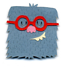
These are the sketches/finishes of the letter I:
They chose the furry one in a puddle of blood at the bottom.
I like how they all look laid out together.
As for the itty bitty illustration:

It was a pretty amazing job and it looks nice
in the magazine next to the picture of Eric.

Thanks to Maili Holiman for the awesome job!


9 comments:
This looks superb. Love it, hon.
Awesome Illustration Great Job. Seriously, it's awesomely illustrated.
so amazing, i love it.
but, wheres my chippy??
Thanks you so much.
Chippy is on the bottom right, below the tennis racket.
really nice! great work!
Awesome work!!
Oh man i saw this in Wired and was blown away, great job Jared. Really awesome work.
rad! I love that type, and yes, the hairy letter is my fave too.
This is so cool!
Post a Comment